2024
Woodsea
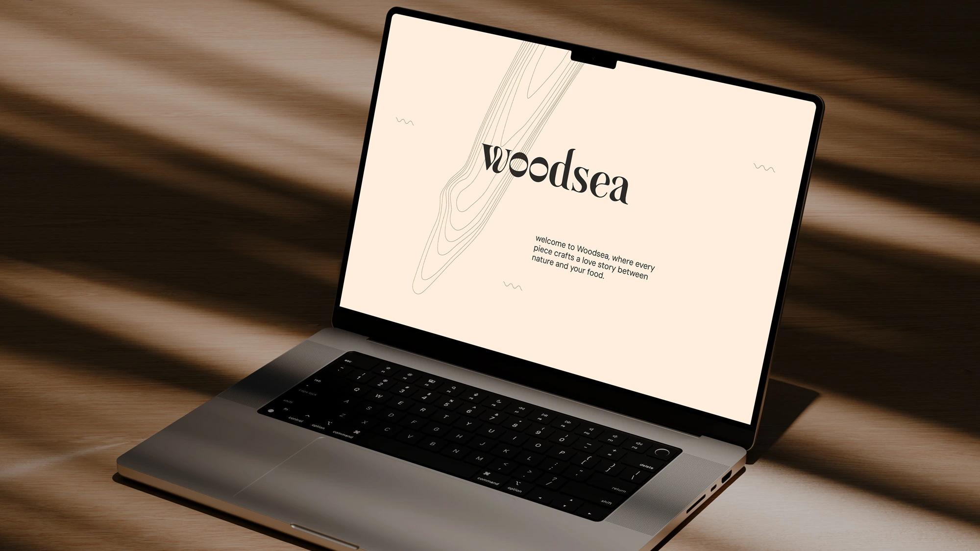
Love story between nature and food
Woodsea is a new family-owned brand creating high-quality, thoughtfully designed wooden kitchen tools.
The client
Woodsea is a new family-owned brand creating high-quality, thoughtfully designed wooden kitchen tools. Previously grouped under a generic giftware label, these products needed a distinct identity to showcase their craftsmanship and unique appeal.
The brief
Without a unique brand identity, these handcrafted wooden products lacked visibility and the value they deserved. Our goal was to create a brand with positioning and identity that would elevate these everyday kitchen essentials, making them recognizable and desirable in their own right. The brand needed to connect with modern consumers while staying timeless, growing naturally with the company’s expansion. We aimed to appeal to B2B clients, like retail chains and restaurants, as well as end consumers seeking affordable, well-crafted kitchenware that balances quality and accessibility.
Brand positioning
Our approach positioned Woodsea as a brand of "sky-reaching quality wooden kitchen essentials, made with love for thoughtful everyday." The kitchen is the heart of the home—or a restaurant—and we believe this space deserves beautifully designed, high-quality tools that bring joy, warmth, and love to daily routines. By connecting nature with the kitchen, Woodsea demonstrates its commitment to quality and respect for natural materials. With this positioning, we tapped into a personal, honest, and loving spirit, creating an everyday essentials brand that inspires customers to craft heartfelt kitchen stories while staying connected to nature.
Name and concept
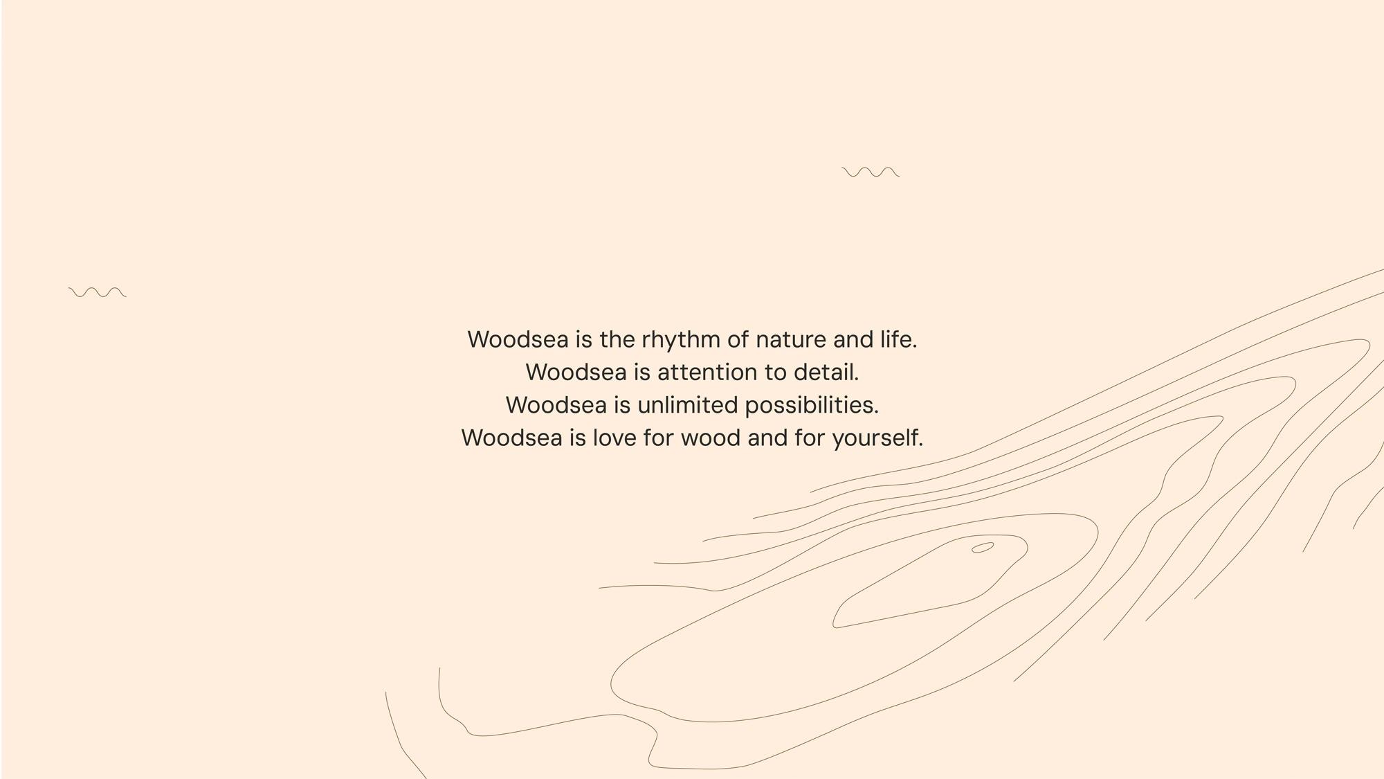
The name Woodsea is derived from "woodsy," evoking a connection to forests and nature, with a twist that introduces the poetic imagery of a “sea of trees.” This duality reflects the brand’s essence: as a creator of essential kitchen tools, Woodsea embodies the rhythm of nature and life with all its different ways of being - represented in wave-like wood patterns that resemble the movement of the sea. This rhythm, which sustains us daily—just as these products do—also embodies the vast possibilities symbolized by the sea and the forest, reflecting the extensive range of products Woodsea brings to life.
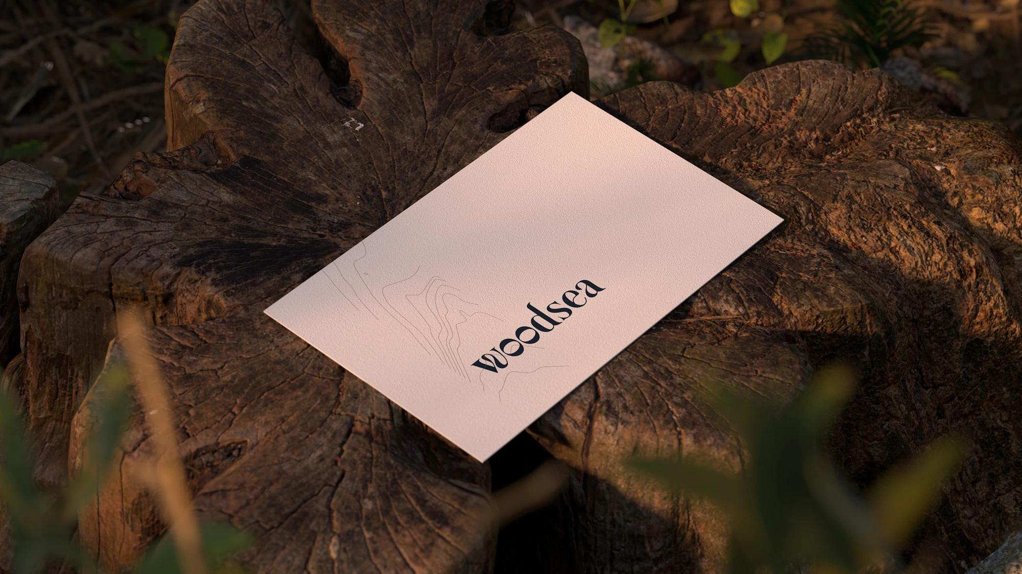
Logo
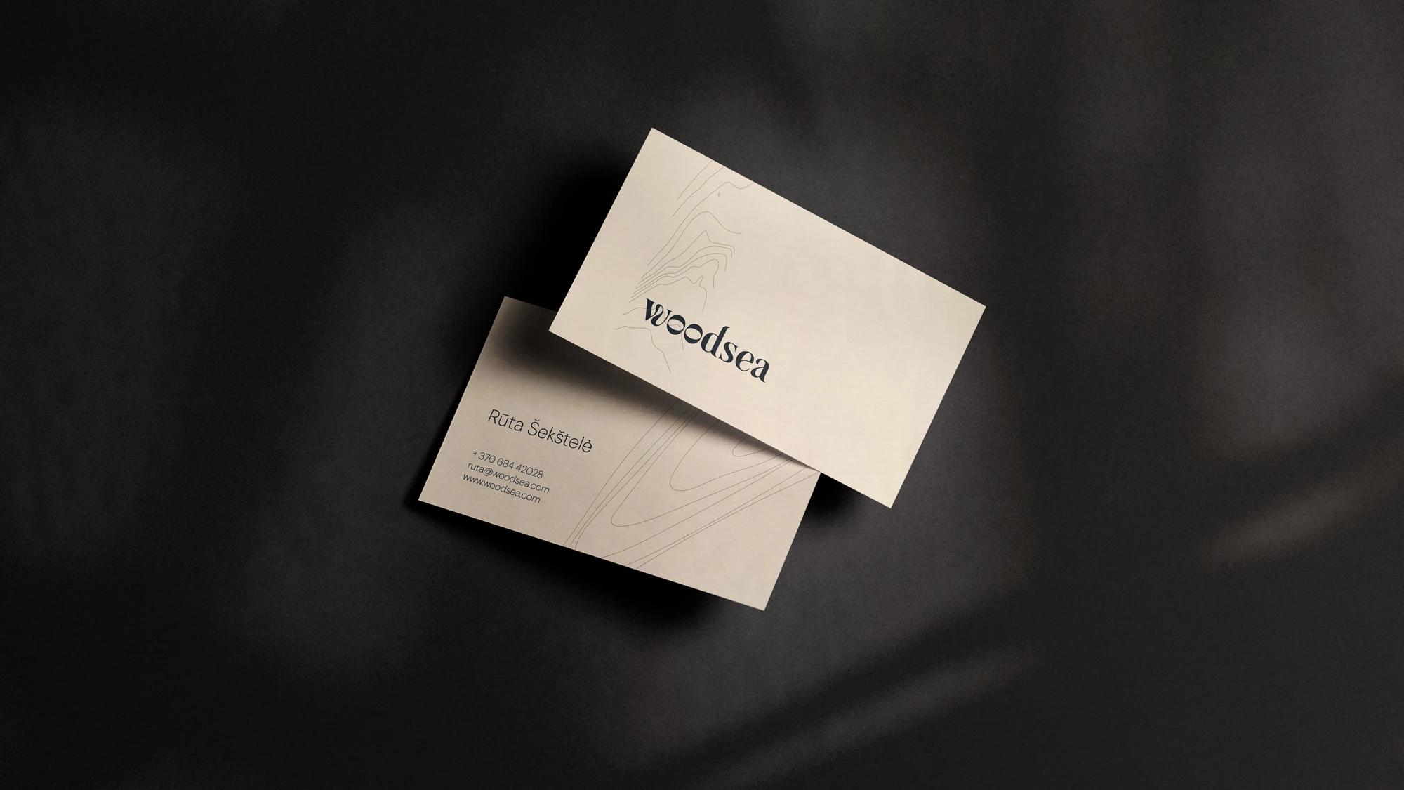
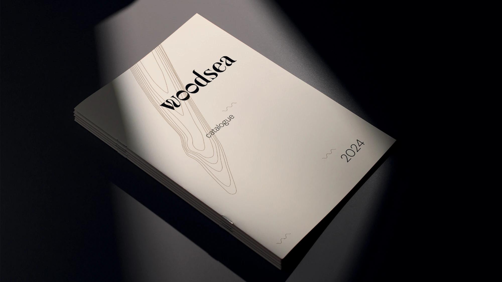
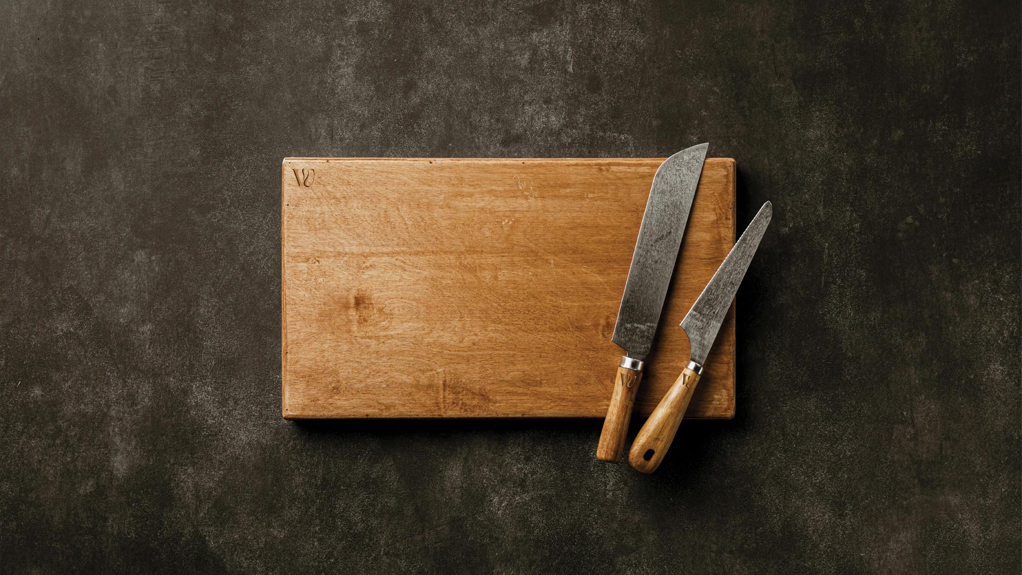
The Woodsea logo is a bold take on a serif style, combining thickness and distinctive curves. The wavy “W” is particularly significant, symbolizing both wood grain patterns and ocean waves. The bold, almost sculptural letterforms bring a trendy, contemporary feel to a classic serif, echoing Woodsea’s mix of tradition and modern craftsmanship.
Applications across media
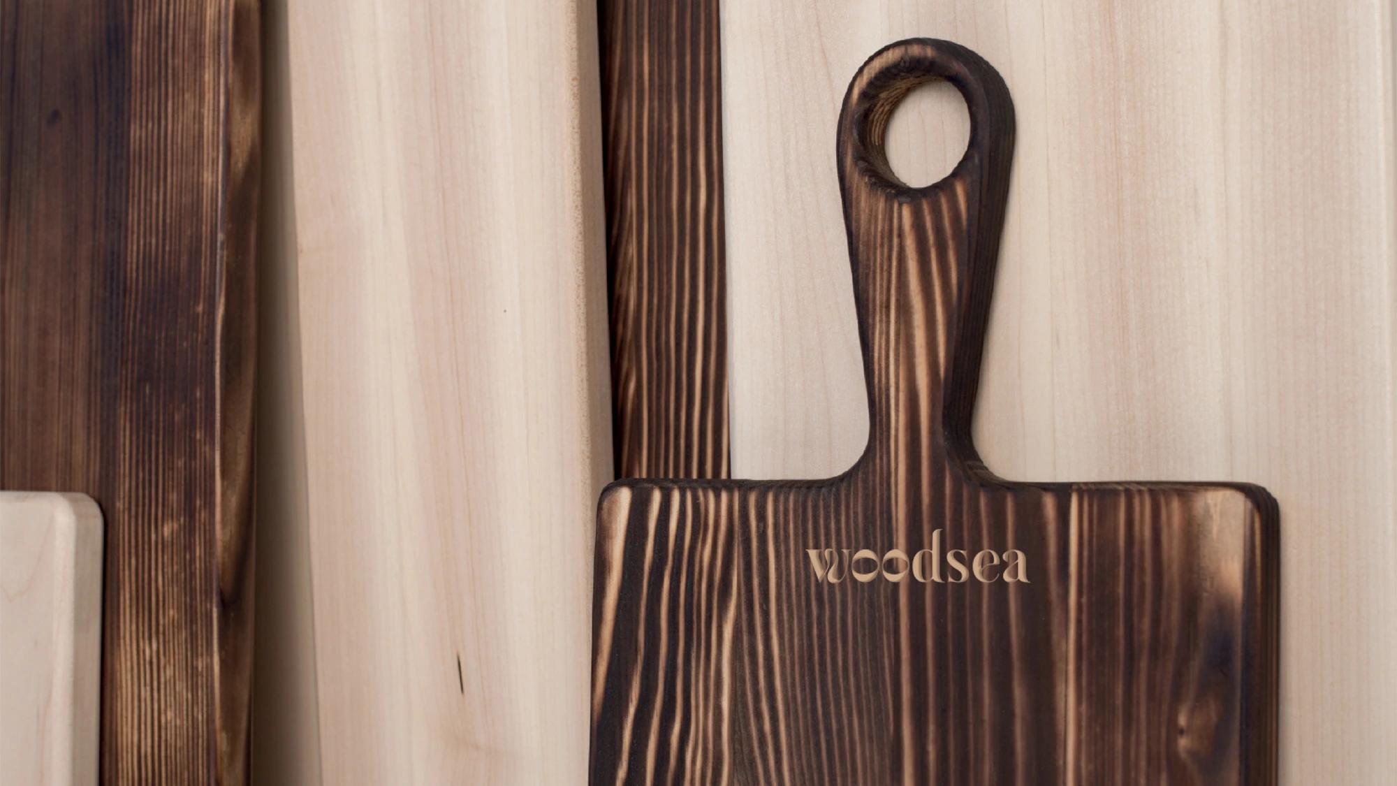
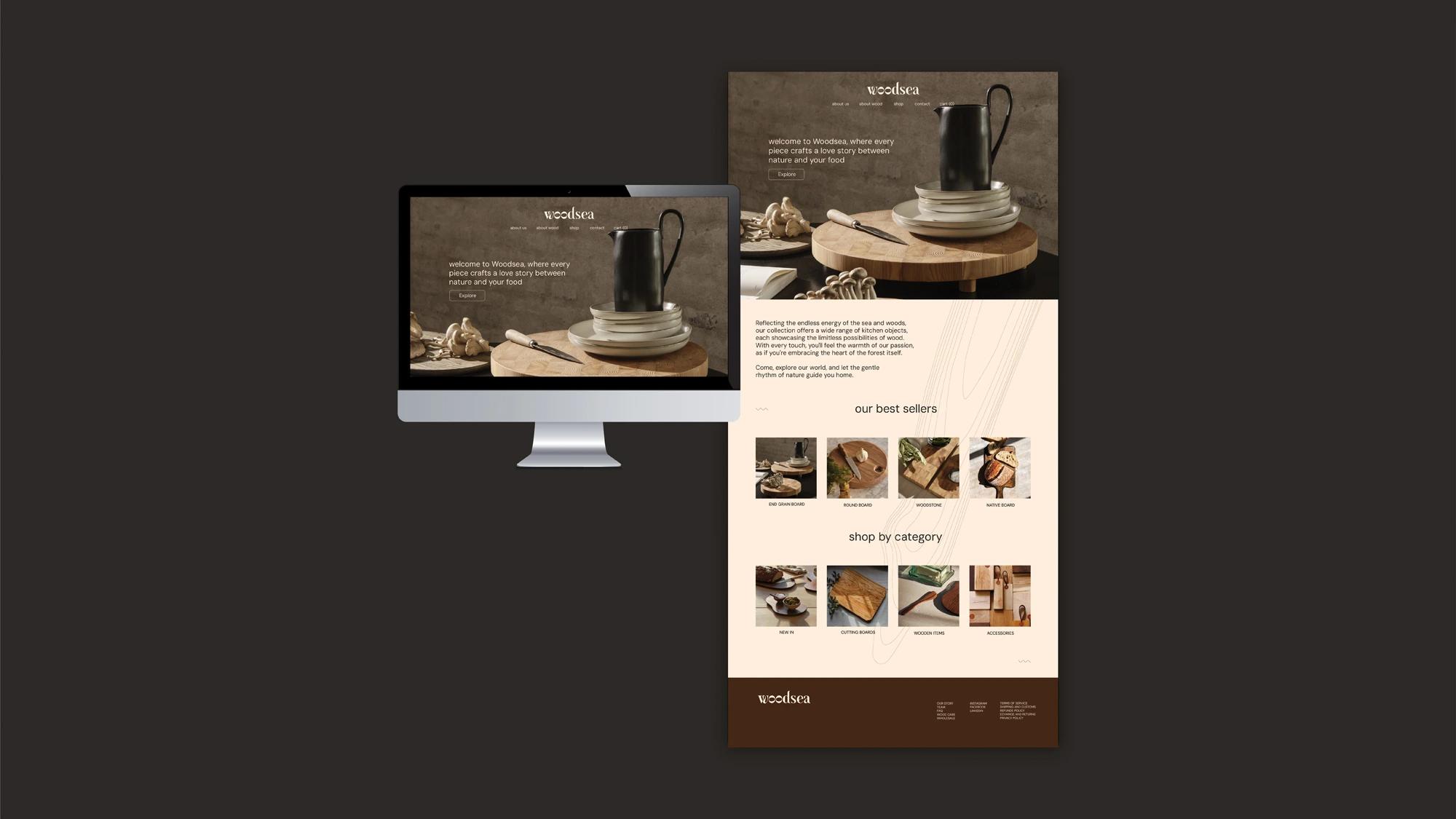
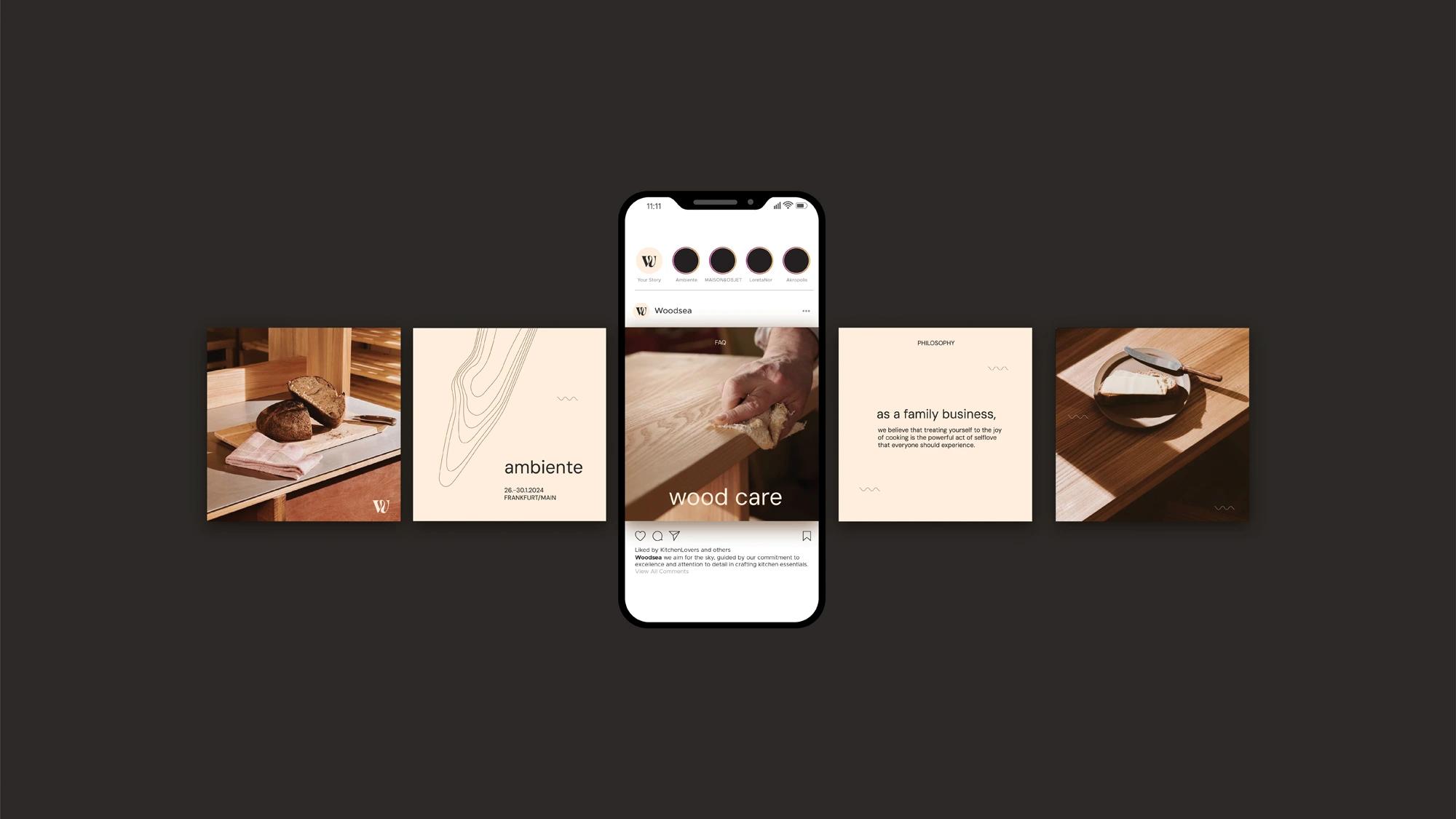
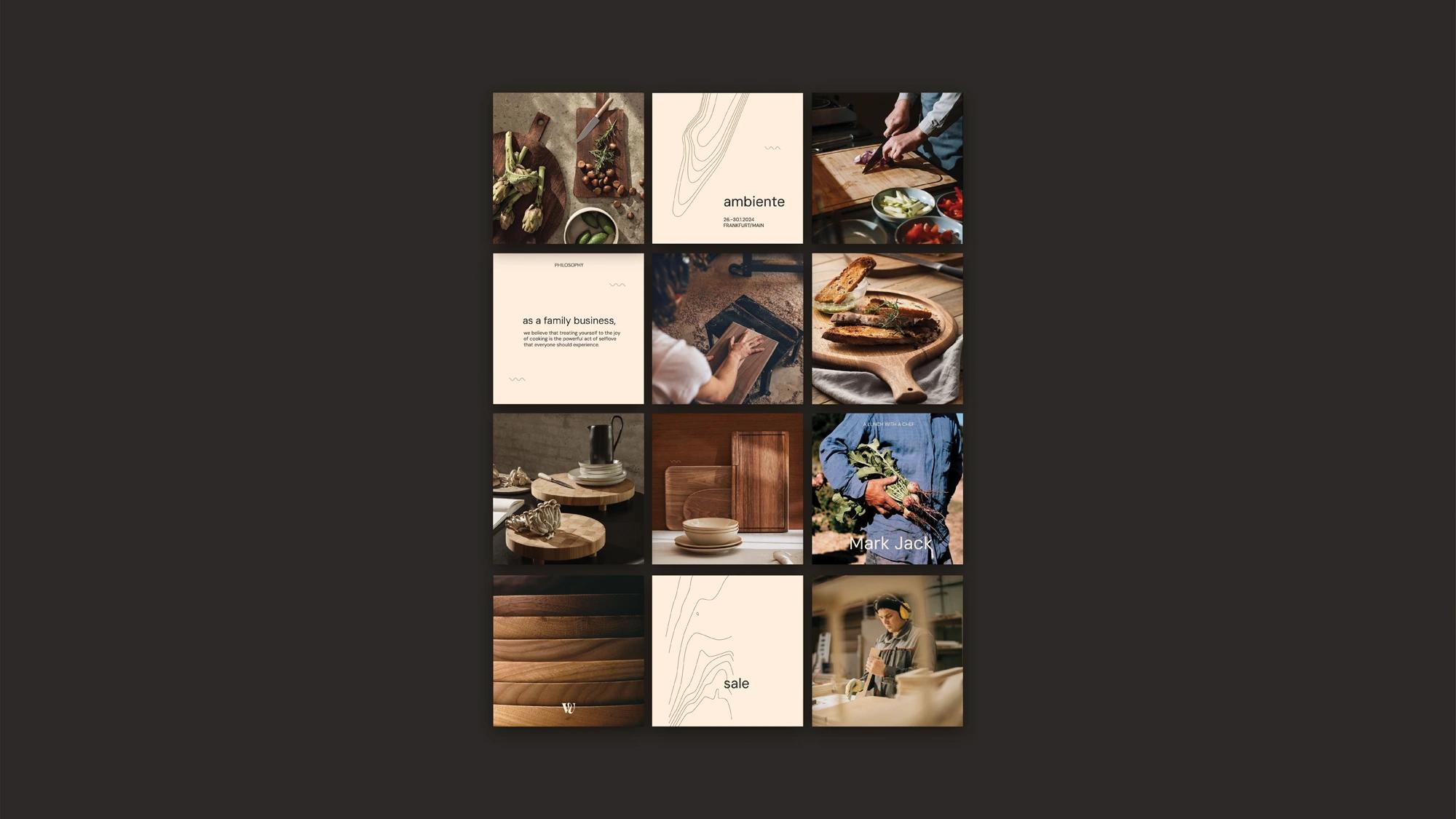
Woodsea’s visual style emphasizes textures and macro details in natural wood, focusing on organic forms and earthy tones. The graphic elements and patterns used in the visual identity are directly derived from the wood grain patterns, bringing the essence of the product into the design. The style is minimal yet authentic, with a limited color palette that allows the products to take center stage. Subtle design elements highlight the brand’s authenticity, ensuring the focus remains on the beauty of the craftsmanship. Photography uses warm, natural lighting to showcase the products' textures, creating a welcoming, warm atmosphere. Visuals capture a range of kitchen scenarios, from close-ups of wood grain to hands-on lifestyle shots reflecting the products in use.
Credits
Creative director
Aurimas Kadzevičius
Creative Strategist & Art Director
Greta Rekštytė
Designer
Anita Bekirova
Project manager
Ugnė Naglytė
Head Designer
Birutė Bikelytė
Copywriter
Greta Rekštytė