2024
Wellgem
Connecting the dots
Highlighting the role of a connector in the biotech landscape
The client
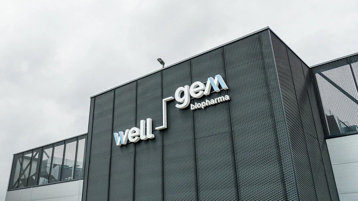
Wellgem Biopharma is a leader in biologics development and manufacturing, offering end-to-end solutions in the biopharma sector. The company sought a comprehensive rebranding to mark its new phase, highlighted by the launch of over 7,000 square meters of laboratory facilities in Kaunas’s ALEX Innovation Park, where it plans to employ more than 100 life sciences specialists.
The brief
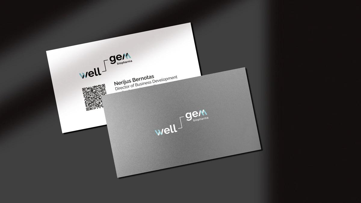
Wellgem Biopharma tasked us with a comprehensive rebranding to support their expansion and reflect their ambitious new chapter. Our work involved a broad scope, beginning with in-depth brand workshops to redefine Wellgem’s positioning, identify their target audiences, and clarify the brand’s archetype and message. We were also responsible for creating a brand book to guide every aspect of their new identity, from the logo and slogan to the visual style, color palettes, and tone of voice. This rebranding effort had to span multiple media, covering everything from stationery, catalogs, and brochures to digital assets, merchandise, presentation templates, and even interior design guidelines—ensuring Wellgem’s brand would be consistent and impactful across all touchpoints.
Branding concept & positioning
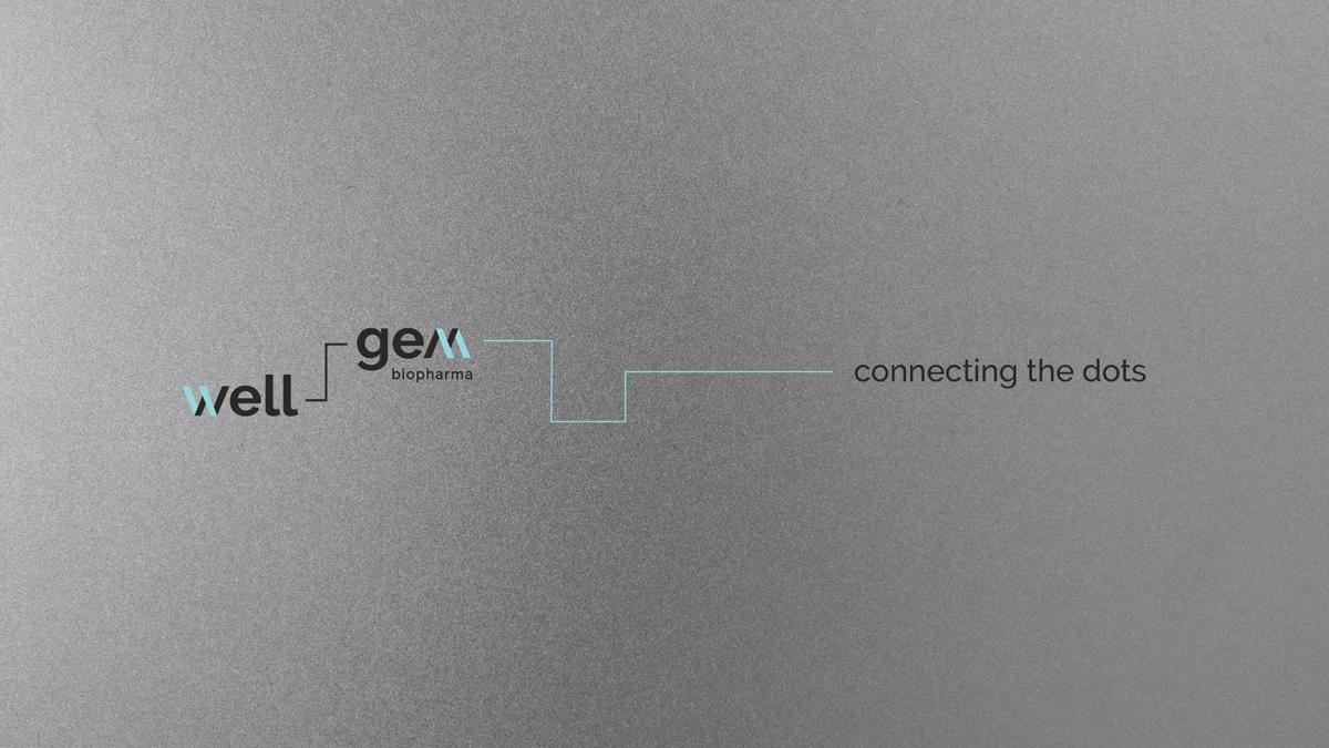
The rebrand was built around the concept 'Connecting the Dots', highlighting Wellgem’s role as a connector in the biotech landscape. Wellgem’s approach—end-to-end, from concept to commercialization—emphasizes collaboration, quality, and precision, values designed to resonate with clients and future employees alike.
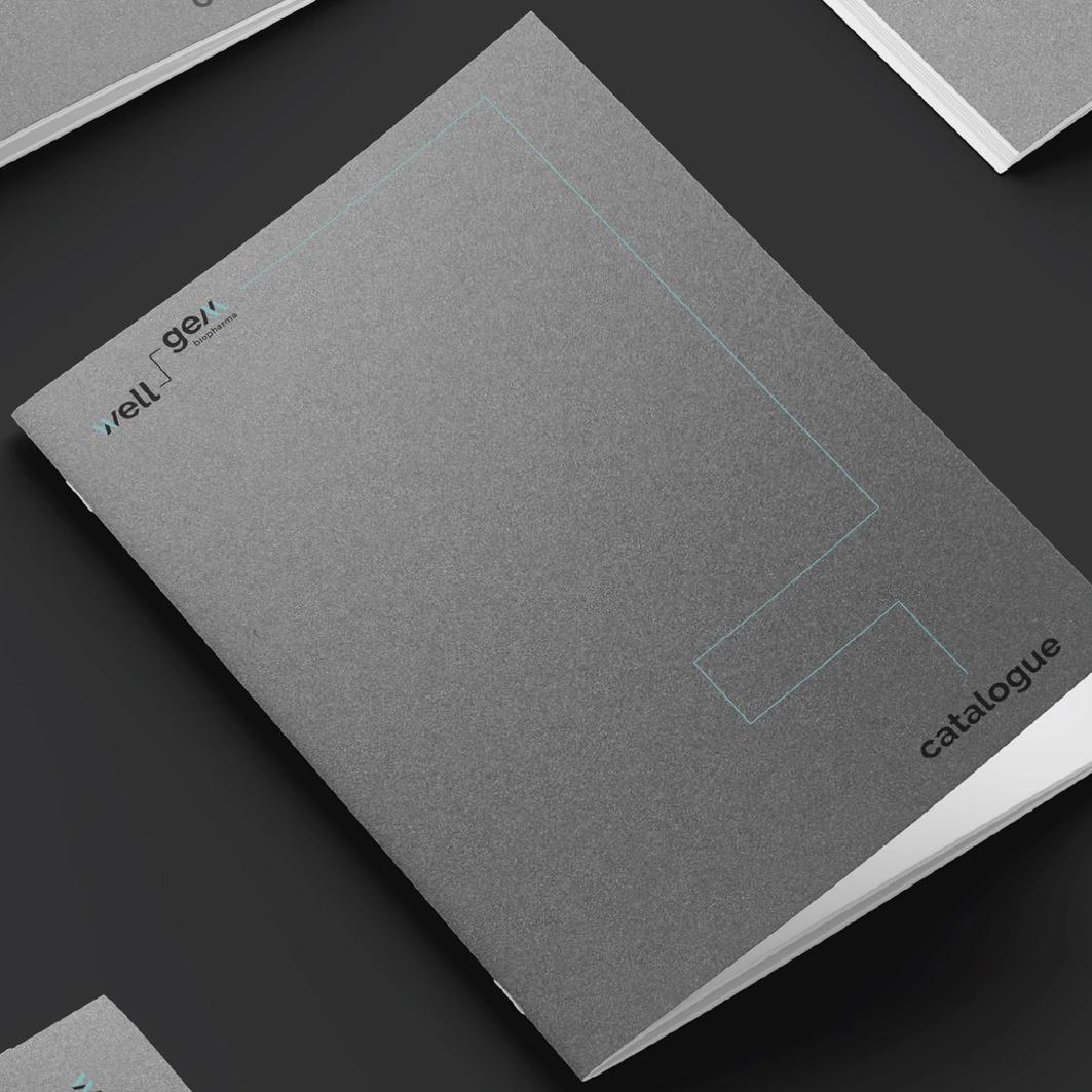
Logo design
The new logo embodies Wellgem’s mission to connect ideas and people. The words “Well” and “Gem” are joined by a line resembling molecular structures, symbolizing unity and structure. Distinctive “W” and “M” elements suggest the company's full-process expertise, while the letter shapes nod to elements of biotech research, connecting back to Wellgem’s roots in science and innovation.
Graphic elements
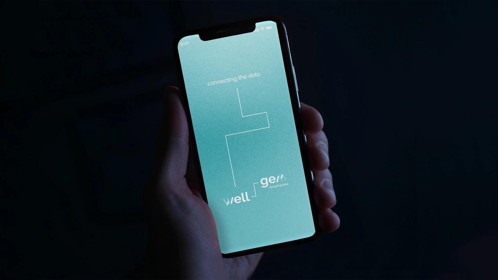
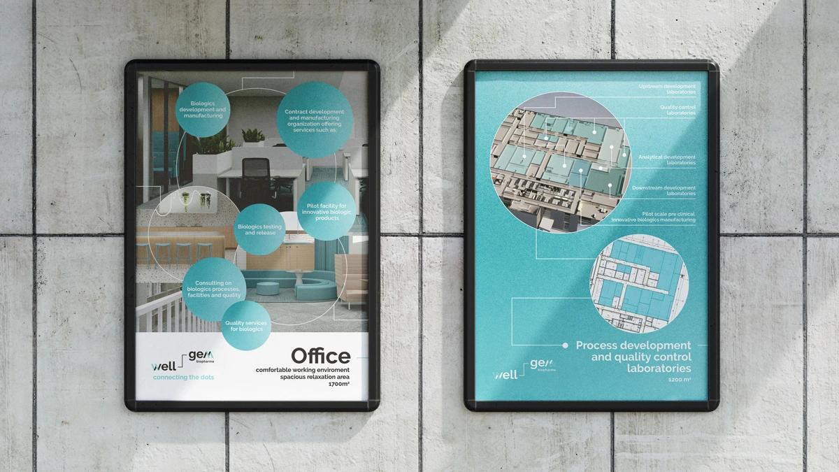
To unify the brand across touchpoints, we developed graphic elements that reflect Wellgem’s structured yet flexible approach. Thin, dynamic lines and dot motifs visually connect ideas, mirroring the brand’s emphasis on precision and partnership. The light teal, grey, black, and white color palette, along with metallic-inspired textures, evokes the high-tech, collaborative spirit of the lab environment.

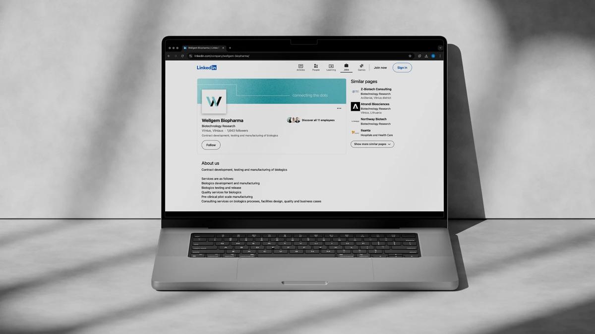
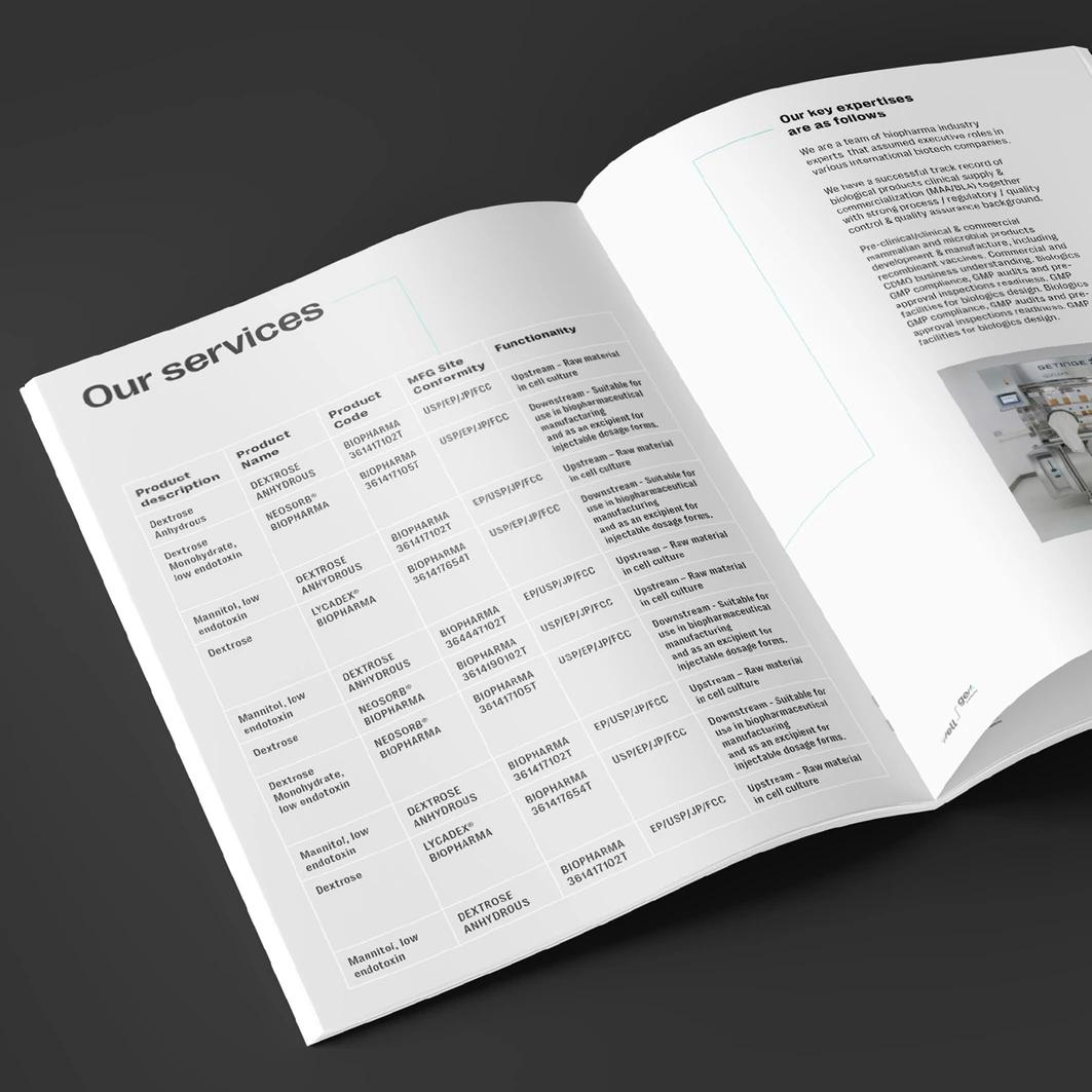
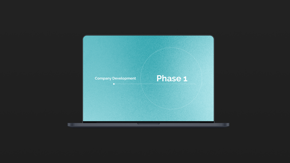
Applications across media
The rebranding extended across all platforms, from printed materials like business cards and brochures to digital assets and presentation templates. Custom-branded merchandise, along with interior design guidelines, ensured a consistent brand experience across both digital and physical spaces. To complete the rebranding, we created a company video (watch it here) showcasing the new facilities, designed to foster transparency and excitement for both clients and prospective team members.


Credits
Creative Director
Aurimas Kadzevičius
Creative Strategist & Art Director
Greta Rekštytė
Head Designer
Birutė Bikelytė
Motion Designer
Marius Linauskas
Project Manager
Ugnė Naglytė
Marketing Manager
Justina Vaitkevičiūtė
Motion Designer
Marius Linauskas
Designer
Anita Bekirova
Copywriter
Greta Rekštytė